Elegance vs. Simplicity
January 17, 2014Company Advancement
March 27, 2014At the moment I’m in the middle of a big re-design of the inventory system in Monsters’ Den. For better or worse, you spend a lot of time interacting with inventory in these games– so it’s a very important system.
If there’s anything you love / hate about the inventory in Monsters’ Den or other RPGs, now is the time to tell me.
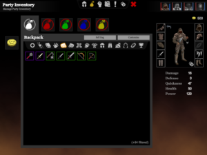
You can see that I’ve abandoned the “sliding panels” approach from Chronicles as space-inefficient. Now it’s a single large box with tabs for bags. But the core of the new design is to combine the Inventory, Shop and Loot screens into one. The layout and method of interaction are now always the same. Any inventory interaction you can perform- whether it’s selling, equipping, moving or using an item- can be done from any of these screens.
This is very important to me, because the ideal I want to accomplish for this game is that you only have to look at an item once. In most RPGs, you find an item and a loot interface pops up. You look at the items and decide whether to take them. Then you go into your inventory and find them, compare them to your current equipment, and perhaps equip them. Then later you visit a shop and sell the unused items (after first looking at them again and making sure you don’t need them). It is so much cleaner, especially in a largely loot-driven game, to be able to do all of that at the moment of actually finding the item.
(Oh, and there’s no more concept of discarding items- an item that leaves your inventory is always sold.)
In previous games, the shop interfaces have always been different to the inventory interface. In Book of Dread the shop used a list inventory unlike the party’s grid inventory. This was just so that I could show the item’s name, instead of a wall of icons. Having got over my fear of the wall of icons, Chronicles had a shop that was controlled by clicking on icons, whereas inventory operations were all based on dragging items. My reasoning for this was straightforward- in the context of the shop, there is only one interaction you can have with each item. If you own it, you want to sell it. If it’s the shop’s item, you want to buy it. So I went ahead and boiled that down to a single click. These reasons seemed good at the time, but in both of the these cases the overall interface complexity was increased and the user was asked to understand a new set of behaviours. I don’t think this is desirable any more.
The loot screen has always needed to serve a couple of functions: you need to be able to choose which items to take and which to discard (sell), and (later, in Chronicles) you need to be able to choose where in your inventory the item goes. These are interactions already present in the inventory screen, so combining them makes so much sense I’m annoyed I didn’t think of it earlier. The loot is implemented as another (temporary) bag, with some additional features (like auto-loot) within it.
This approach also has obvious benefits in terms of the amount of work it requires from me- one interface instead of three. Or it would if I hadn’t already built all three before embarking on the redesign. Game development!

